Navigation
COMP3001- Technology Management and Professional Issues
Analytics Application and Data Visualisations
- We acquired and analysed multiple data sources
- This big data is analysed to detect network anomalies
- We built data visualisations to show bicycles availability
- We show the effect engineering works has on availability
Project has lasted for 4 months. It required us to collaborate with doctorate students from National Institute of Informatics in Tokyo.
Our Final Group Report
Click here to view it.Product Video
Final Product
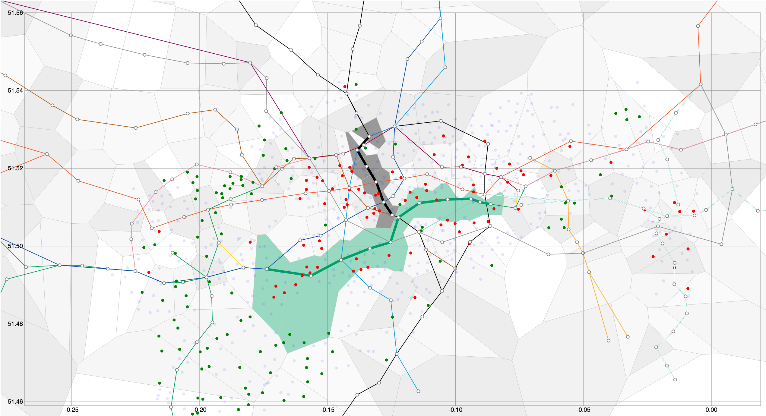
This image shows how TFL could use our data visualisations to map tube closures on the District Line and Northern Line.
Team 5
- Marcin Cuber(MTL)
- Jonny Manfield(TL)
- Nicola Greco(EL)
- Toshiyuki Nishino(NII)
- Ran Gutin
- Edward James
- Navid Hallajian
- Mohan Dai
- Ragavan Guneshalingham
- Michael Detmold
- Richard Isaac
- Christodoulos Demetriades
- Keqin Feng
Key: (MTL) - Management Team leader, (NII) - National Institute of Informatics, (EL) - Engeneering Team Leader, (TM) - Team Leader
Demo
Development
Initial visualisation
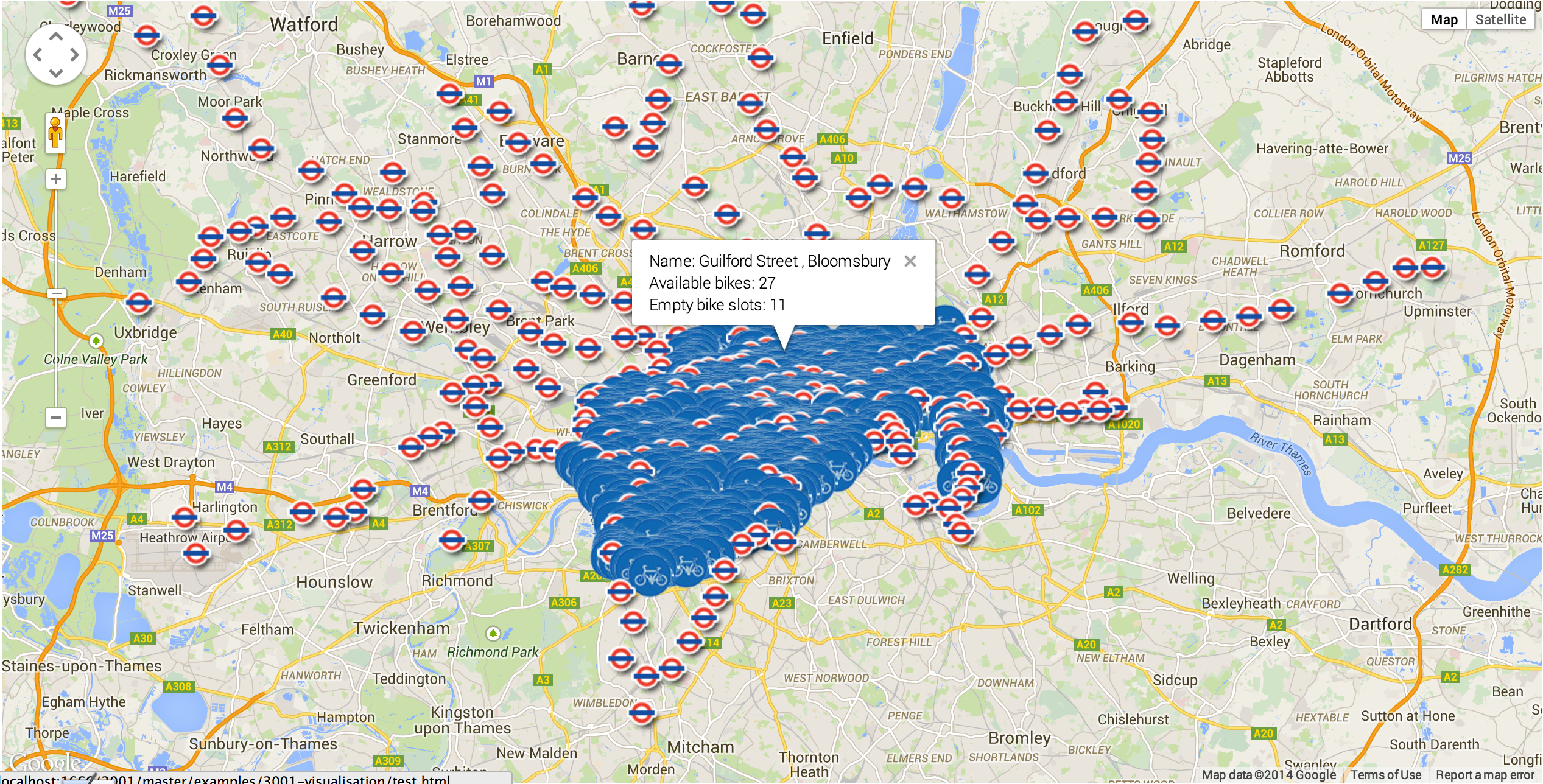
tubeMaps Open source Library with 100 stars!
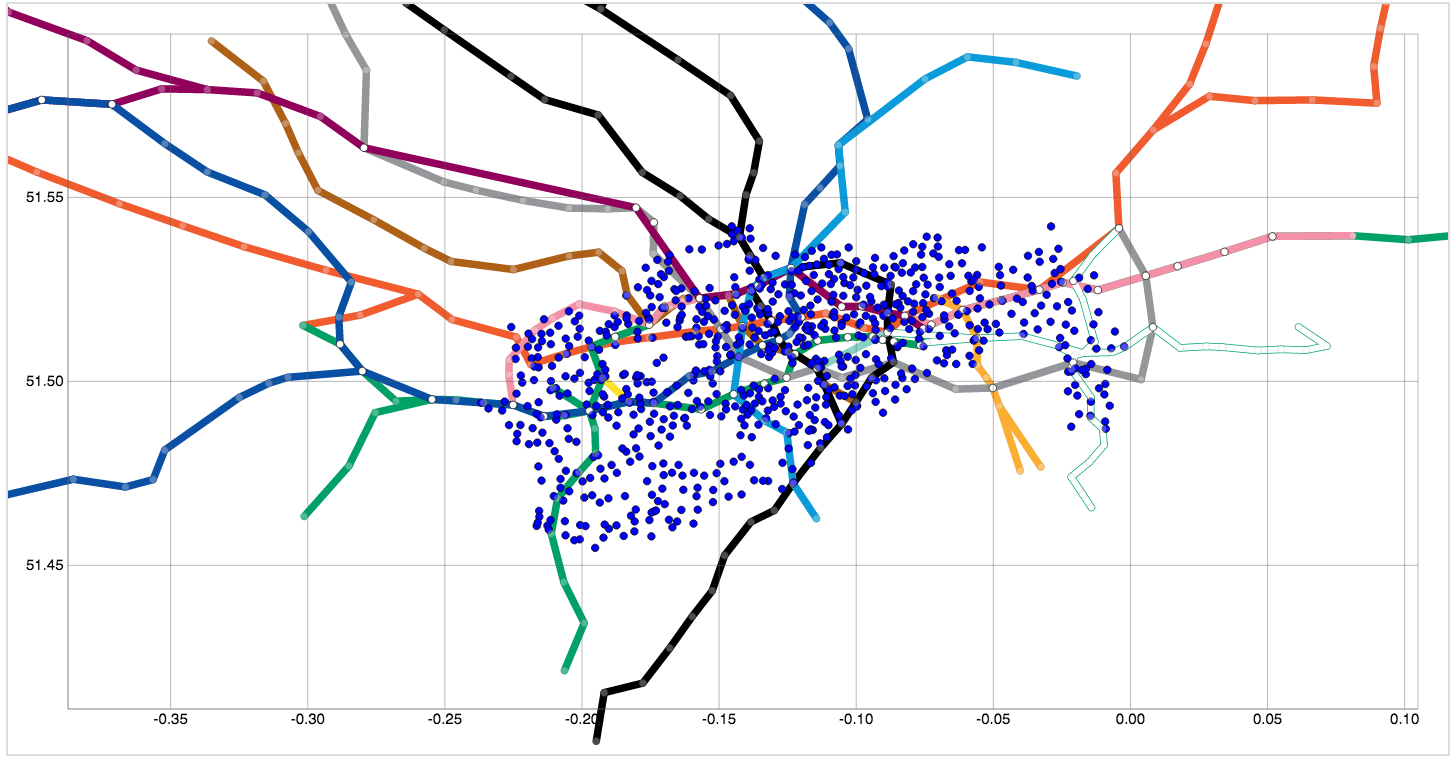
Visualisation Key
Green = 2 bikes away from empty
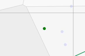
Red = 2 bikes away from full
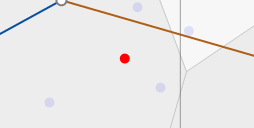
Global network visualisation to show empty or full docking stations
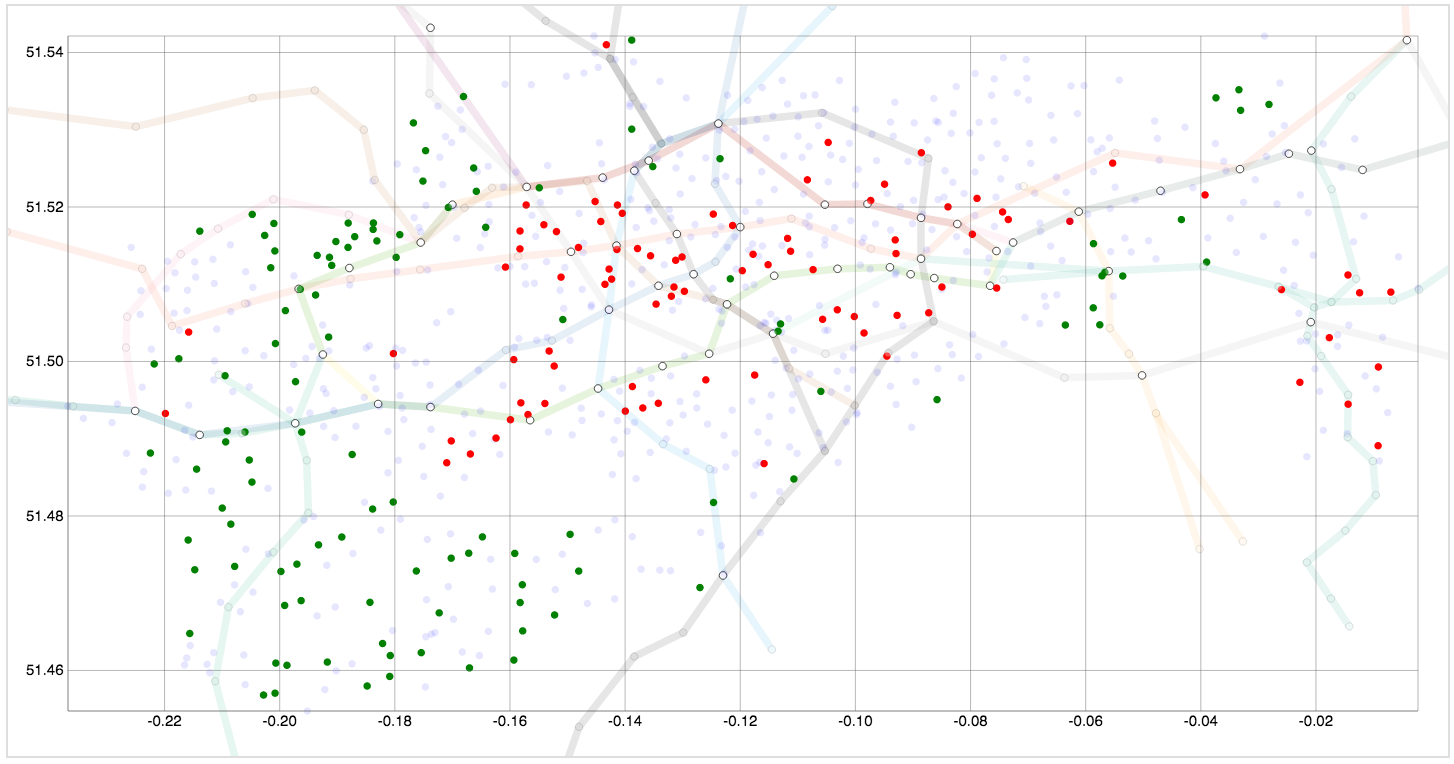
Initial Voronoi visualisation

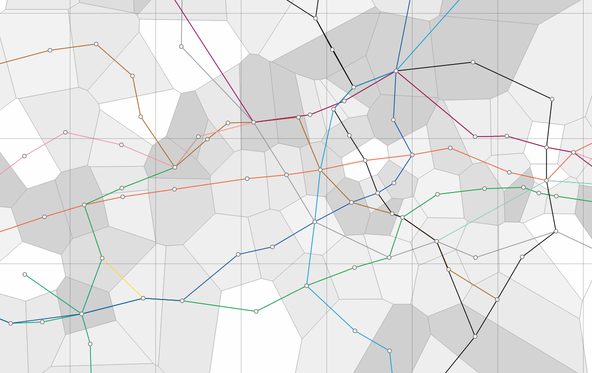
Voronoi diagram of London
